13 Ways To Spice Up Your Organizational Chart

We’re all familiar with the typical organizational chart. If you’re lucky, it’s a whiteboard marker on butcher paper. If not, it might be some half-baked PowerPoint that no one looks at after you’ve presented to management.
Why does your org chart suck? It probably looks like your organization is a well-oiled machine; there are autocratic leaders who barely communicate with the team, and everyone seems to know their place. If you think your organizational chart sucks, don’t worry we’re here to help. Here are 13 ways on how to spice up your org chart and make the most out of it.
1) Add some self-starters to the top.
There are leaders who need to be in control of every single thing that happens, and then there are people who don’t need managers at all. Self-starters trust their own opinions and are motivated by autonomy. These are the workers you want developing new products, building side projects, or leading small teams because they don’t need a manager breathing down their neck to get shit done.
2) Use colors, not lines.
Adding leaders to the org chart makes sense since they manage people and resources. Adding color instead of solid lines represents networking, resources such as capital, or knowledge that extend beyond the organizational boundaries. Even though there are multiple managers above one position, there still might not be enough capital within the organization to hire a person for that role. In this scenario, you could either merge those positions with others or expand beyond the organizational structure altogether.
3) Display the most used communication methods.
If your content management system serves as a virtual watercooler full of knowledge and best practices that employees accumulate over the years, it might be a good idea to display those communication vectors on your org chart:
When new employees join the team and ask experienced ones for help, they’ll know where to look first.
4) Show reporting relationships.
If you’re organized by project instead of position, you need some way to communicate who works on what. This might be especially useful for cross-functional teams with product managers, backend developers, and UX designers who all contribute to the same project.
5) Create a wiki page on your company’s website.
Your org chart should reflect how you actually work together. An accurate representation is important because it shows potential new hires what they’ll get themselves into if they accept an offer. If you’re not entirely sure how your company organizes itself, post your org chart on your homepage.
6) Use different shapes to represent different types of roles.
Different shapes make it easy for employees to find their place in the organization at a glance. For example, round shapes could be for managers who work with employees, while square shapes could be for employees who work with data.
7) Show reporting lines.
While reporting relationships between managers and their reports are important, it’s also useful to show how each department is structured. Is your team managing designers? Are there any front-end developers in the marketing team? A good hierarchy chart makes it clear how people are organized within the company.
8) Show workflow dependencies.
It’s not enough to simply show how people are organized, you need to visualize who works on what together. A must-have feature for any project management tool is a Gantt chart that shows how tasks depend on each other:
As you can see above, the backend of the website is planned before designers start working on mockups.
9) Use different shapes to show people’s roles.
Different shapes make it easier for employees at a glance to find their place in the organization, especially if they display the name of each role alongside its outline. Shapes are also useful for visualizing project dependencies across departments.
10) Create a profile page for each employee.
Employee profiles are useful because they show what people are passionate about outside of work. It’s an easy way to visualize someone’s background, interests, and skillset without having to dig through their LinkedIn profile or resume. You can also display portfolios, blog posts, apps built in-house, or any other content that people created themselves.
11) Show each person’s impact on the business.
With an org chart, it’s easy to show what each employee brings to the company. This is especially important if you’re hiring remotely or your workforce spans multiple time zones because it can be difficult for someone who’s not close by to feel like they’re part of the team.
12) Choose a font and color scheme that complements your brand.
If your company’s logo is red, it makes sense to use purplish colors for titles and names to reinforce the visual connection between those two elements. Similarly, a thick sans-serif font would contrast nicely with a thin serif one, and a light gray background with dark text would be easy on the eyes.
13) Highlight notable past work.
To show potential new hires what they’d get themselves into if they accepted an offer, you need to communicate how your company operates in detail. This might include highlighting which projects are most important for the business, examples of successful work, or known challenges.
14) Use Venngage.
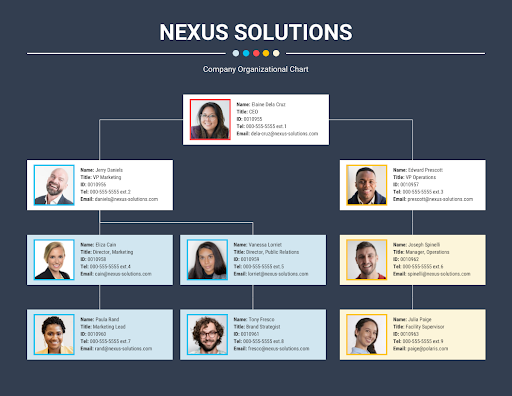
Venngage is a free and online graphic editing platform that provides various org chart templates you can use for your company. If you’re having problems with making org charts, Venngage is the solution. All you need to do is create your free account, choose a template, and customize it to your liking. To give you an idea, here are some organizational chart examples from Venngage.
What can you do with an org chart?
An org chart is a great way to communicate who works on what at your company. You can use it to show how people are organized, which roles exist within the business, and how workflows are structured. It’s also useful for hiring purposes because employee profiles can include information like people’s skillsets, interests, and experience.
An org chart can also communicate other important information to potential new hires like who the C-suite reports to, where your company fits into your industry, or what roles are most vital for the business. The visual organization of an org chart makes it easy for everyone to see how the company is structured at a glance.
Enhance your company hierarchy and create an effective system using free organizational charts from Venngage today!


